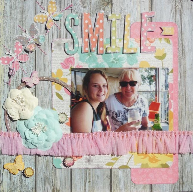
This week at Lets Get Sketchy you can add a banner, a cluster of some embellishments and a horizontal photo.
I stuck to the sketch and made a cute banner out of butterflies which l added some hand stitching to. I love the pink ribbon trim l ran under my photo and l cut out the letters to make my title and popped them up
I really do like this collection from Simple Stories. These are some of my favourite colours.
Here is the sketch to follow
Come on over and check out the sketch and join us this week :)
Monday, 26 August 2013
Monday, 12 August 2013
LGS
Here is my latest offering over at Lets Get Sketchy. The challenge was to use a long title.
This was my baby boy who is now 19! Wow where have all those years gone?
I bought a new doilly die cut which l just had to use!
The papers are Echo Park and the lettering is Basic Grey
Come on over and check out what the girls on the DT have done this week :)
This was my baby boy who is now 19! Wow where have all those years gone?
I bought a new doilly die cut which l just had to use!
The papers are Echo Park and the lettering is Basic Grey
Here is the sketch to follow
Come on over and check out what the girls on the DT have done this week :)
Monday, 5 August 2013
Super Quick Post
This month My Creative Sketches have a new sketch to play along with.
I have used papers from Fab Scraps and Basic Grey, embellishments from Prima and Manor House.
Here is my take
I have used papers from Fab Scraps and Basic Grey, embellishments from Prima and Manor House.
Here is my take
Some close ups
This is the sketch
Thanks for looking and have a great day :)
Thursday, 1 August 2013
Sharing Today
Hi there, l thought l would share a couple of layouts l made for the American Crafts DT call.
I used products from their Strawberry Lemonade range which are bright and summery.
I have kept the colour choice to blue, white and a dash of yellow.
I have done some masking and added blue ink over parts. I added a hand stitched frame as if l was outlining the main elements.
To this layout l firstly misted the cardstock with pink and blue.
I've used a border punch on two pattern papers and distressed the other edges of all my papers.
Then l've run several rows of machine stitching around the dark blue acting as a border. The watermelon elements are sitting on a Spellbinders die cut.
I used a die cut as my title and outlined it with blue liquid pearls.
I love this photo of my daughter!
I also made this card
I cut a circle, folded it in half and then embellished.
Thanks for looking and have a great day :)
Subscribe to:
Posts (Atom)